Packaging Design
NatureGreenz Product Line
Overview
Designed packaging and product labels for NatureGreenz across personal care, home care, and food products. The work involved creating a consistent visual identity across different product categories while adapting the design, imagery, and information hierarchy to each product.
The Challenge
The challenge was to connect different product categories under one NatureGreenz identity while giving each category its own visual character. Soaps, shampoo, detergent, and food products required different imagery, information, and visual priorities.
The designs needed to make each product easy to identify while maintaining a consistent look across the overall product range.
The Solution
I developed a consistent packaging framework using the NatureGreenz logo, typography, colour system, and natural visual elements, then adapted the layouts and imagery for each product category.
Soaps: Packaging focused on natural ingredients and skin benefits, using botanical elements and an earthy visual treatment.
Shampoo & Personal Care: Bottle labels with clear product names, benefits, ingredients, and usage information.
Liquid Detergent: Functional layouts focused on cleaning benefits, usage instructions, and product information.
Food Products: Product-focused packaging using food imagery and clear product and nutritional information.
The same core brand elements were maintained across the range while the visual treatment changed according to each product category.
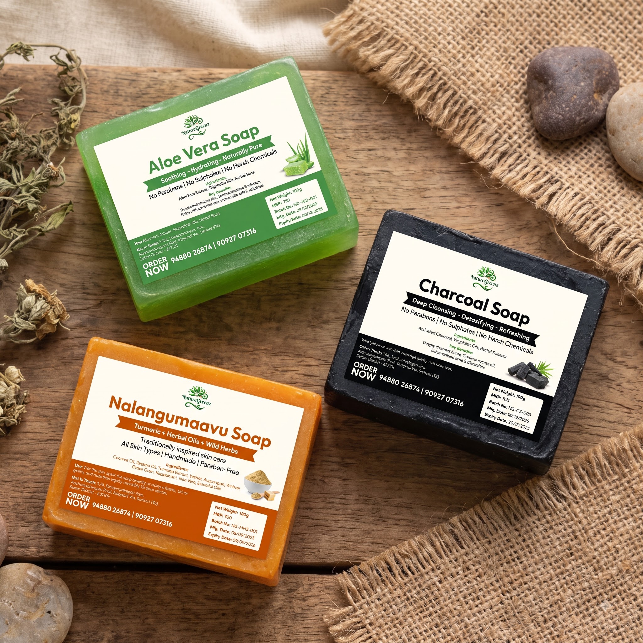
Soap product line — hero mockup showing premium natural soap bars
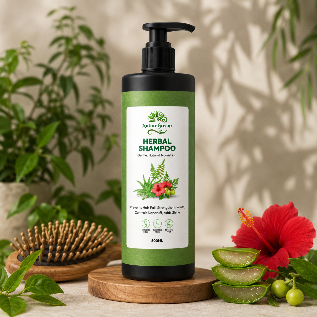
Shampoo bottle design — personal care category
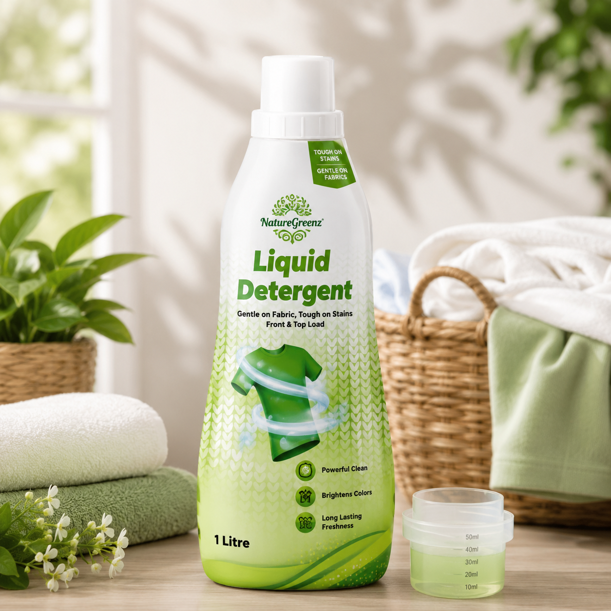
Liquid detergent packaging — home care category
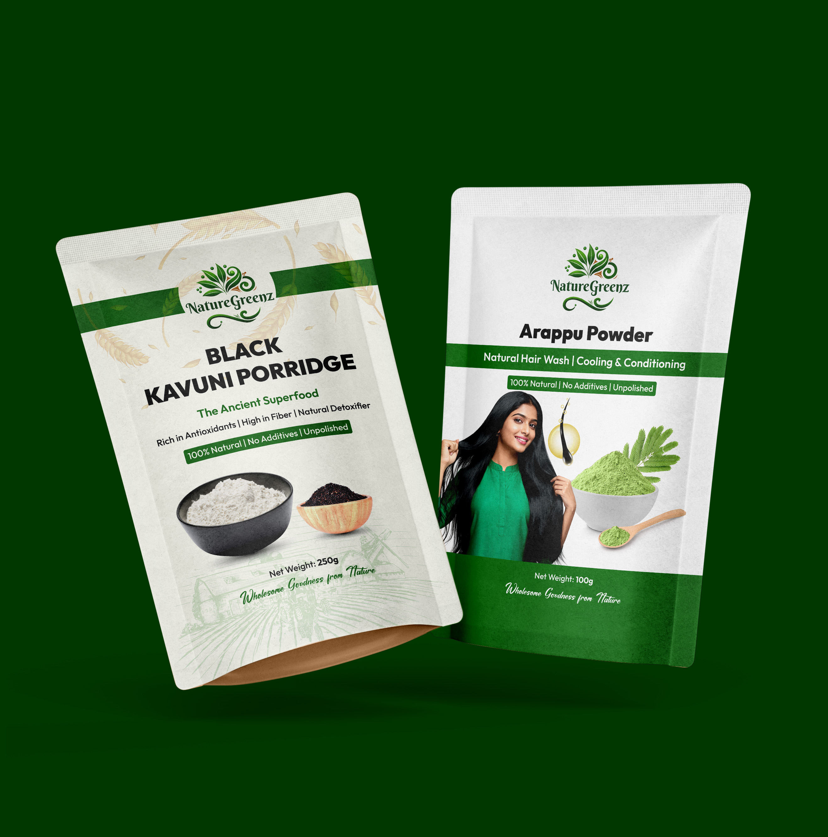
Food product packaging — natural food category
Outcome
The final packaging system created a consistent NatureGreenz identity across personal care, home care, and food products while giving each category its own visual treatment. The designs were developed as a flexible system that could be extended across the wider product range.
Tools Used
 Photoshop
 Illustrator